A great site historyworld.net had a great chronological layout of information on how handwriting developed and eventually became print. I enjoyed reading the article it had that was relevant to my topic because it was concise, thorough and clear.
Before the invention of the Gutenburg press all manuscripts were carefully handwritten and letterforms were strategically figured out by measuring the height of the letterforms. One of the most popular characteristics for most handwriting was to write in all capital letters because it felt elegant, legible and formal. Early manuscripts followed this style in Italy in the 7th to 8th century AD (HistoryWorld). Much of the handwriting that we see today is derived from scripts written very early on, similar to Hadrian’s Wall that dates to AD 100. The fragments of writing are difficult to read today, but you can faintly see letterforms that are quite similar to the English language and other western European languages that are still existent today. Celtic monks in Ireland during the 7th and 8th century used more of a script writing in their documents.
“To emphasize the beginning of an important passage, the scribes write its first letter much larger than the rest of the text and in a grander style. Slightly embarrassed by the difference in scale, they tend to reduce each succeeding letter by a little until reaching the small scale of the ordinary text” (HistoryWorld).
Inscriptions from Hadrian’s Wall in Roman Britain.
Source: http://www.pbase.com/image/71657265
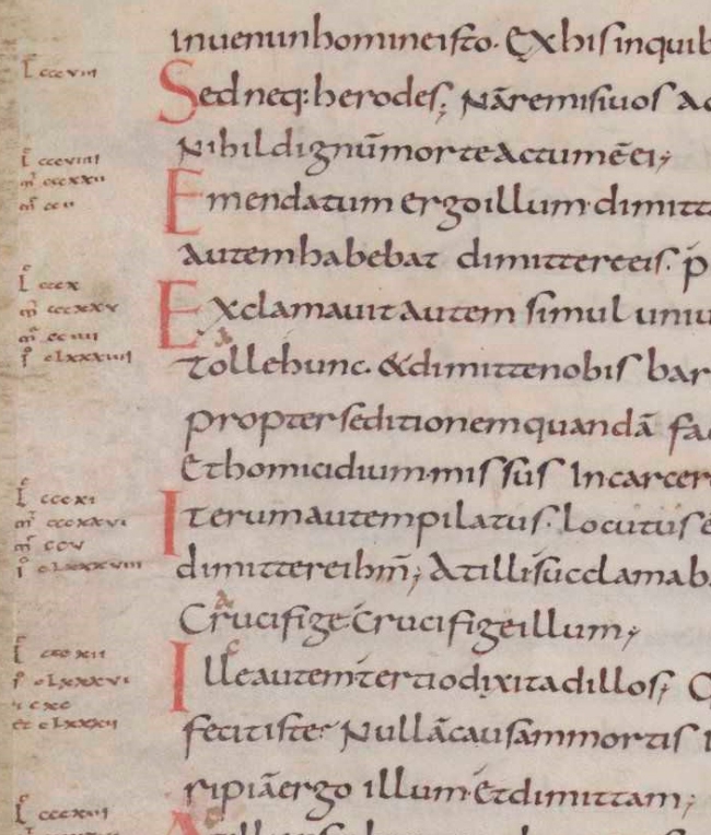
Most writing culminated with the rise of Christianity and writing of religious scriptures that were written by monks and other Christian holy figures. Calligraphy soon budded off of the idea of using scripts in manuscripts and incorporated distinctions between lowercase and uppercase letters. In AD 780 with the rise of emperor Charlemagne, a scribe is commissioned and writes The Godesalc Evangelistary, the first book that the script Carolingian minuscule is featured (HistoryWorld).
A close up of Carolingian minuscule style text.
Source:http://conscriptio.blogspot.com/2012_08_01_archive.html
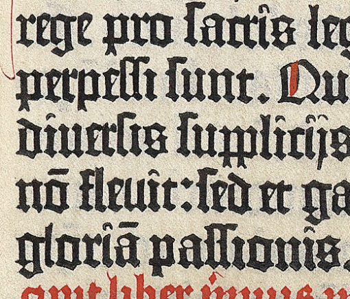
Within the Middle Ages the Carolingian minuscule style was lost and replaces by black letter style that was a dark, thicker weighted letterform. The reason why this style was created was because it condensed the letters getting more words on a page, costing less and put books up for availability quicker. This style was carried over into the age of printing on the Gutenburg press because of its conventional style (HistoryWorld).
Black letter type used in a Gutenburg printed book.
Source: http://typophile.com/node/63562
Sources Cited: http://www.historyworld.net/wrldhis/PlainTextHistories.asp?ParagraphID=flk


